
Fonts might seem like a small part of your video editing process, but they have a big impact. The right font can make a scene feel powerful, professional, warm, or even fun. The wrong one? It can distract viewers or send mixed signals. That’s where font psychology comes in.
As a video editor, you probably spend a lot of time thinking about framing, pacing, color correction, and sound design. But typography is just as important, especially for businesses aiming to connect with audiences in a clear and compelling way. Fonts are visual tone-setters. They speak before your voiceover does. They whisper credibility or shout excitement before anyone clicks play.
What is font psychology?
Font psychology is the study of how typeface design affects perception, mood, and decision-making. Just like color theory, font psychology taps into human emotion and cognition. It’s about the way we respond, consciously or not, to the shapes, lines, and styles of letters on screen.
When you choose a font for a video, you’re not just picking something that looks good. You’re picking something that says something. It might suggest trustworthiness, modernity, friendliness, or elegance. The font you use to introduce a corporate annual report should not be the same one you’d use for a fashion reel or startup pitch.
Think of fonts as visual cues. They prepare your audience for the message they’re about to receive.
Types of fonts and their impact
Fonts fall into broad categories. Each category carries its own set of emotional associations. When used effectively, these fonts can enhance the tone and message of your video.
Serif fonts: traditional and trustworthy
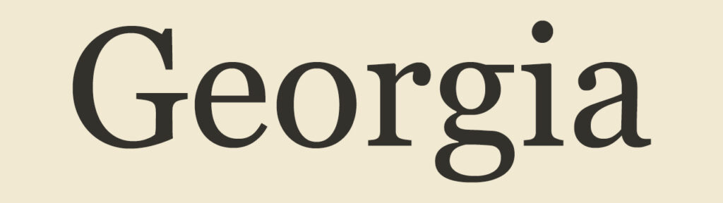
Serif fonts have small lines or strokes at the ends of each letter. These fonts have a long history and are often seen in print. That makes them feel classic, established, and reliable.
Use case: Corporate presentations, legal updates, financial overviews, educational material.
Examples: Times New Roman, Georgia, Garamond, Baskerville.
Serif fonts create a sense of professionalism. They’re serious. So when you want viewers to trust the content or brand, serif fonts are a solid bet.
Sans-serif fonts: clean and contemporary
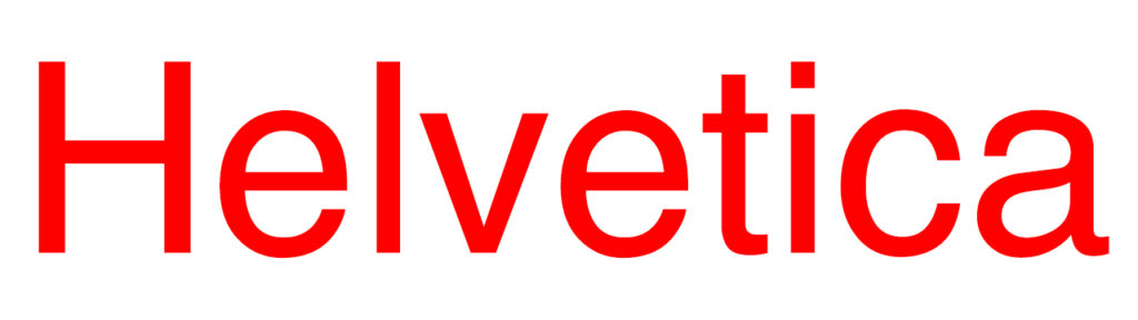
Sans-serif fonts remove the extra lines. They are modern, streamlined, and easy to read on screens.
Use case: Tech demos, explainer videos, internal comms, minimalist branding.
Examples: Helvetica, Arial, Futura, Roboto.
Sans-serif fonts are incredibly versatile. They’re perfect when clarity matters most. If your video walks through product features or presents hard data, these fonts help your message land with impact.
Script fonts: elegant and expressive

Script fonts mimic cursive handwriting. Some are formal. Others are playful.
Use case: Title cards, lifestyle content, luxury branding, emotional storytelling.
Examples: Pacifico, Brush Script, Great Vibes, Allura.
These fonts aren’t great for body text or captions. But in moderation, they add charm or sophistication. They’re perfect when you want something to feel personal.
Display fonts: bold and attention-grabbing
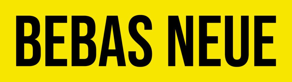
Display or decorative fonts are highly stylized. They’re made to stand out. Because of that, they should be used with caution.
Use case: Intros, transitions, bold branding moments.
Examples: Impact, Lobster, Bebas Neue, Playfair Display.
Display fonts are not for every project. But if you want to surprise or energize your audience, they can do a lot with just a few letters.
Monospaced fonts: technical and neutral
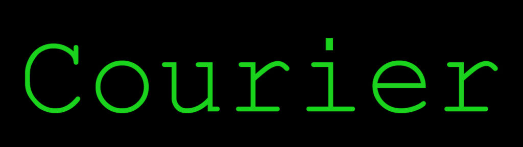
Each letter in a monospaced font takes up the same amount of horizontal space. This gives the font a mechanical, structured feel.
Use case: Coding tutorials, software intros, tech branding.
Examples: Courier, Consolas, Inconsolata.
Monospaced fonts can signal clarity and objectivity. When used carefully, they emphasize precision.
Additional factors in font psychology
Font choice is just the start. Other visual elements affect how your type feels and functions.
Weight and thickness
Bolder fonts feel strong and urgent. Light fonts come across as delicate, refined, or quiet. You can use weight to create contrast or emphasis without switching font families.
Case
All caps feels assertive or even aggressive. Title case (capitalizing the first letter of each word) often feels balanced and clean. Lowercase feels casual and informal.
Spacing
Tight letter spacing can feel cramped or intense. Wide spacing suggests luxury, airiness, or space to breathe. This applies to both character spacing (tracking) and line spacing (leading).
Color
The emotional tone of your font changes with color. A bold sans-serif in black feels serious. The same font in orange might feel energetic. Match color with brand personality and the context of your scene.
Size and scale
Larger fonts dominate the screen. They demand attention. Smaller fonts feel more subtle. Scaling your fonts creates hierarchy and helps guide the viewer’s eye.
How you can apply font psychology to video editing
As a professional editor, you already know the importance of visual coherence. Font psychology fits right into your toolkit. Here’s how you can put it to work.
Match the font to the message
Every project has a tone. It might be confident, serious, fun, or heartfelt. Your font should mirror that tone. Are you launching a new product? Use something clean and modern. Summarizing your team’s quarterly goals? Stick to a font that feels formal and clear.
Reinforce brand identity
Most businesses already have brand guidelines that define primary and secondary fonts. Use them when possible. If you need to break from the brand standard, stay close to the visual spirit of those fonts.
Combine fonts with purpose
Try pairing two fonts: one for headlines and one for body text. For example, a serif header paired with a sans-serif body adds visual contrast while keeping things legible.
Just make sure the fonts don’t clash. Avoid pairing fonts that are too similar or too radically different.
Use Animation Thoughtfully
The way your text moves also affects perception. A script font that fades in slowly can feel elegant. A bold sans-serif that zips across the screen feels dynamic. Keep your motion consistent with the tone of the type.
How to choose a font/fonts for your video
Choosing a font doesn’t have to be overwhelming. Try working through this short checklist:
- Define your tone. What feeling should viewers walk away with?
- Review brand guidelines. Start with what’s already approved.
- Consider your audience. Different fonts resonate with different viewers. A younger audience might appreciate something fresh or playful.
- Test for readability. Will this font hold up on small screens?
- Create a visual hierarchy. Use size, weight, and contrast to guide the viewer’s eye.
- Limit your font palette. One to two fonts per video is usually enough.
When in doubt, keep it simple. A clear message delivered in a well-chosen font will always outperform something overly complicated.
Ensuring readability and accessibility
Great design should be inclusive. Your fonts should work for as many viewers as possible.
Prioritize Legibility
Choose fonts with distinct, easy-to-recognize letterforms. Viewers should be able to absorb information at a glance, especially on fast-moving or information-dense scenes. Avoid fonts that are overly condensed or too ornate, since they tend to blur at smaller sizes or low resolutions. High x-heights and open counters improve readability across all devices.
Use High Contrast
Good contrast helps your text stand out and keeps it readable in any setting. Place light fonts on dark backgrounds or dark fonts on light backgrounds for maximum clarity. Avoid color combinations that can be jarring or difficult to distinguish, especially for viewers with visual impairments. Always test your font colors under different lighting conditions and on various screens.
Optimize for Screen Sizes
Videos are viewed on everything from phones to projectors. A font that looks crisp and legible on a desktop monitor might become unreadable on a smaller screen. Always test your typography across devices to spot any scaling or spacing issues. Design with mobile-first in mind when targeting wider audiences.
Add Captions Thoughtfully
Captions are a key accessibility tool, so their readability matters. Use a clean, sans-serif font that stays legible at smaller sizes and doesn’t compete with the visuals. Keep the text large enough to be comfortably read but small enough to avoid obstructing important elements in the frame. Stick to a consistent style and placement so viewers always know where to look.
Stay Consistent
Consistency builds trust and helps the viewer follow your message without distractions. Avoid switching fonts midway through a video unless you have a clear narrative reason. Use transitions, size, and weight to shift tone or emphasis without disrupting the visual flow. When your type remains steady, the viewer stays focused on your story.
How Visla helps you with fonts
Visla makes it easy to stay picky with your fonts by letting you upload any font directly to your brand kit. That means you’re not stuck using a limited list of defaults, and you can stay fully on-brand in every video. Whether you’re working with a custom typeface or just have a few go-to favorites, you can access them instantly across all your projects. On top of that, Visla is built for streamlined, professional video editing, so you can keep everything, typography, cuts, audio, transitions, and more, within one intuitive platform.
FAQ
Font choice affects how your audience feels about the message you’re delivering. A formal serif font can signal professionalism and credibility, while a fun script font might come across as creative or casual. If your font feels off-brand, it can confuse your viewers or dilute your message.
Yes, but keep it simple. It’s usually best to stick to one or two fonts that complement each other to create visual hierarchy. Too many fonts can feel cluttered and distract from your message.
Sans-serif fonts like Roboto, Helvetica, or Open Sans are ideal. These fonts are clean, legible, and designed for screen readability, even at smaller sizes. Avoid anything too decorative or condensed.
Visla lets you upload any font you want into your brand kit, so you’re not limited to presets. This means your videos can fully align with your brand identity down to the typography. It’s a flexible option for businesses with specific design requirements.
Start by making sure your font has high contrast against the background and is large enough to be read easily on mobile. Then check that the tone of the font matches the tone of the message. These small adjustments go a long way in keeping your audience engaged.
May Horiuchi
May is a Content Specialist and AI Expert for Visla. She is an in-house expert on anything Visla and loves testing out different AI tools to figure out which ones are actually helpful and useful for content creators, businesses, and organizations.