
Subtitles set the tone of your story as much as footage, music, or pacing. When they look sharp and read clean, viewers stick around. When they clash with your brand or feel sloppy, they bounce. That is why we built the Visla subtitle style library. You get beautiful, ready‑to‑use templates that you can customize once, then share across every team. Your videos stay consistent. Your workflow gets faster.
What are subtitles?
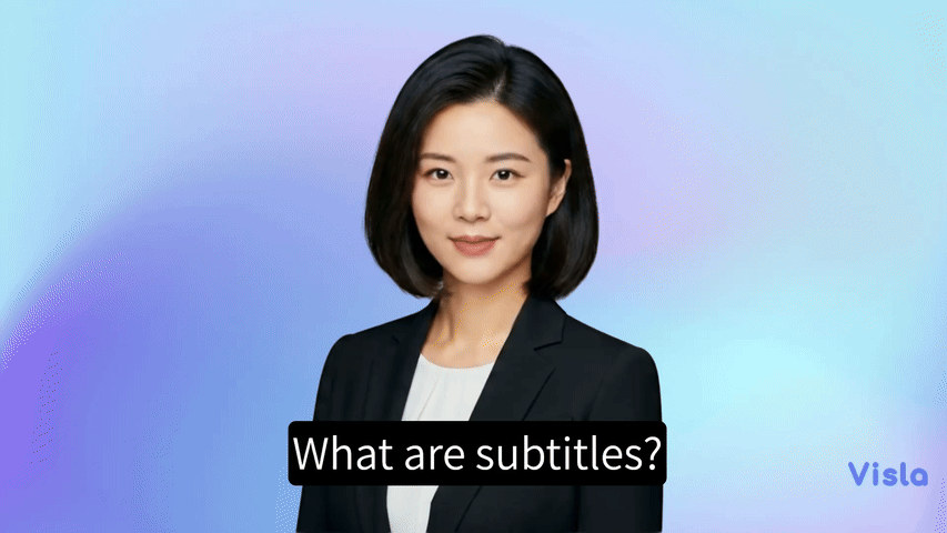
Subtitles are on‑screen text that reflect what people say in a video. They help viewers follow the dialogue or narration without relying on audio. Subtitles usually capture spoken words. Captions often include extra audio cues like [laughter], [music], or [applause]. Many teams use the terms interchangeably. The important part is this: text on screen should help people understand the content quickly and comfortably.
Good subtitles do more than mirror speech. They guide attention, reinforce key points, and create rhythm. In short, they help your story land. Viewers make decisions fast. Clean, readable subtitles remove friction and earn another few seconds of watch time. That matters on social feeds and internal updates alike.
Why are subtitles important?
Videos travel across devices, regions, and contexts. For many, sound is often turned off, so subtitles keep your message visible everywhere.
They also expand reach. Non‑native speakers lean on on‑screen text to parse nuance. People in loud spaces use captions as a backup when audio fails. People who learn visually prefer text as a second channel. When you add thoughtful subtitles, more people finish your video. That lifts engagement and recall.
Subtitles also support search and reuse. Transcripts create text you can index, quote, and repurpose. Teams can pull lines into social posts, product guides, and help docs. With Visla, you generate those transcripts automatically while you edit, so the benefits come bundled with your normal workflow.
How do subtitles impact accessibility?
Accessibility is not a nice‑to‑have. It is table stakes. Clear subtitles make content usable for people who are Deaf or hard of hearing. They also support viewers with auditory processing challenges or attention differences. Thoughtful style choices improve readability for everyone. High contrast, strong legibility, and predictable placement reduce eye strain. Viewers finish with less effort. That is inclusion in practice.
How subtitle style impacts your viewers
Style is a signal. The font, size, color, and motion of your subtitles shape how people feel about your brand and your message. Get the details right and your video feels premium. Miss the details and attention drifts.
Font psychology
Typefaces carry personality. Sans‑serif families feel modern, efficient, and friendly. Serif families read classic and authoritative. Rounded fonts come across as warm and casual. Condensed styles look technical but can hurt legibility if you push them too small. Pick a font that matches your brand voice, then test it on a phone at arm’s length. If you squint, your audience will too.
Size and weight
Aim for comfortable reading across aspect ratios. Subtitles should feel present, not overwhelming. Heavier weights hold up over bright footage. Lighter weights feel refined but can disappear over complex scenes. Keep line length short and stick to one or two lines. Viewers should finish each subtitle just as the next line appears.
Color choices
Color sets mood and signals hierarchy. White text with a subtle shadow is a safe baseline. Brand colors work well for emphasis, but keep contrast high. If you color all of your subtitles, that color stops meaning anything. Use accent color to highlight a keyword or a call to action. Let neutral text do the rest.
Backgrounds and effects
Shadows, strokes, and boxes increase legibility over busy footage. Soft drop shadows feel natural and protect edges. Thin strokes help lighter fonts hold their shape. Rounded background chips make long lines easier to scan. Resist the temptation to stack every effect at once. Two thoughtful choices beat five loud ones.
Highlighting
Highlights can direct attention and make key phrases stick. Use color, bold, or a background chip to mark important words. Avoid over‑highlighting. When everything shouts, nothing lands. Reserve highlights for product names, numbers, or calls to action.
Language and tone
Write subtitles like you speak. Break long sentences into shorter beats. Remove filler words that do not add meaning. Keep punctuation simple. Your viewer reads at a glance. Clean phrasing keeps pace with the story.
How Visla’s subtitle style library works

You should not rebuild subtitles from scratch in every project. With Visla, you do not have to.
Start with a template
Open your project and choose a subtitle preset from the Visla style library. Each template follows best practices for contrast, spacing, and readability. You can use it right away or treat it as a jumping‑off point. Either way, you ship faster.
Customize in your Brand Kit
Set your font and default case. Choose colors for default text, keyword highlights, and the text outline. Pick effects like drop shadow, a background color, or animated highlighting. Save these choices to your Brand Kit. You codify your standard and remove guesswork for everyone.
Sync across the Workspace
Visla applies your saved style to any video in your Workspace and Teamspaces. New teammates join and get the right look on day one. Agencies can keep different Workspaces for different clients and switch with a click. Your brand stays consistent without reminders or review cycles.
Let AI do the heavy lifting
Visla uses AI to create subtitles for uploaded or Visla-generated videos, and you can quickly edit the results for accuracy. It’s just like editing a text document. Our tool also includes automatic subtitle translation into English, Italian, French, Portuguese, Spanish, German, and Dutch to expand accessibility and reach.
FAQ
Visla’s subtitle style library is a set of ready-to-use, fully customizable subtitle templates that keep every video on brand across your team. You pick a preset, set fonts, colors, outlines, shadows, effects, and more in your Brand Kit, then apply it in one click. The style syncs across your Workspace so every editor starts from the same baseline. You ship consistent, professional captions on every channel.
Open your video, choose a preset from the subtitle style library, and adjust typefaces, sizes, shadows, highlight animation, highlight colors, and backgrounds in your Brand Kit. Save once and your updates roll out to your Workspace and Teamspaces. Your captions stay readable and on brand without manual rebuilds.
High-contrast text, legible fonts, and predictable placement help more people follow along, including viewers who are Deaf or hard of hearing. Clean styling reduces eye strain and keeps attention on the message, which lifts retention and completion rates. Smart highlights guide focus to product names, numbers, and calls to action. Consistent, on-brand captions signal quality and build credibility over time.
May Horiuchi
May is a Content Specialist and AI Expert for Visla. She is an in-house expert on anything Visla and loves testing out different AI tools to figure out which ones are actually helpful and useful for content creators, businesses, and organizations.