
Quick Answer
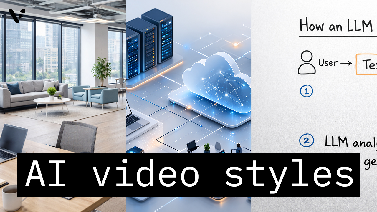
AI video styles in Visla AI Director Mode control the look of the AI-generated storyboard images and AI video clips in your final video. You choose the style before you generate the storyboard and before you turn selected scenes into motion, so the style helps shape the whole visual direction of the project. The right choice depends on the job the video needs to do, whether that is a product demo, training video, internal communication, healthcare explainer, finance video, or brand campaign. For most enterprise teams, the best starting points are photorealistic, minimal, explainer, tech, finance, and healthcare-focused styles. Those styles usually give you the best mix of trust, clarity, consistency, and brand safety.
How AI video styles work in Visla AI Director Mode
In Visla AI Director Mode, the selected style shapes the visual output of your AI-generated scenes. You choose the look up front, generate a storyboard around that direction, review the scenes, and then turn selected scenes into clips. In practice, that helps teams make more intentional videos because the visual language is set earlier in the workflow instead of being improvised at the end.
If you want to see what these styles look like in practice, Visla also has a Video Wall with example videos made in AI Director Mode. You can browse real outputs, filter by style or use case, and compare different visual directions before choosing the one that fits your project best.
The best AI video styles in visla AI director mode for B2B marketing, product demos, training, and enterprise communication
If you’re choosing an AI video style for a B2B marketing video, product demo, training video, internal communication, customer education video, or executive update, you usually do not want the most experimental look first. Most enterprise teams need styles that feel clear, polished, consistent, and easy to align with a brand. In Visla AI Director Mode, the safest starting point is to pick a style that matches the business context before you generate the storyboard. That usually means photorealistic, minimal, explainer, tech, finance, or healthcare-focused visuals instead of highly stylized art directions.
The table below shows the best starting points for serious business video use cases.
| Style | What it looks like | Best for | Less ideal for |
|---|---|---|---|
| Photorealistic | Realistic, polished, business-friendly visuals | Product marketing, customer stories, executive videos, general B2B content | Highly abstract concepts that need diagram-heavy explanation |
| Corporate Minimal | Clean layouts, restrained visuals, professional simplicity | Company overviews, internal comms, SaaS explainers, leadership messaging | Campaigns that need strong emotion or visual drama |
| Quiet Luxury Minimal | Premium, elevated, refined minimalist visuals | High-end services, premium branding, executive-facing marketing | Fast, instructional, step-by-step training content |
| Cinematic | Dramatic, high-production-feel visuals | Launch videos, hero sections, brand storytelling, campaign videos | Dense explainers where clarity matters more than mood |
| Infographics | Data-forward, clear, structured visual explanation | KPI explainers, reports, performance updates, business education | Emotion-led brand storytelling |
| Whiteboard Explainer | Familiar explainer format focused on teaching | Onboarding, tutorials, training, educational content | Premium brand videos or product-launch assets |
| Isometric Tech | Structured, system-oriented, modern tech visuals | SaaS demos, cloud workflows, cybersecurity, platform explainers | Lifestyle or human-centered brand storytelling |
| 3D Render | Dimensional, product-focused, design-led visuals | Product showcases, hardware, concept videos, product detail scenes | Text-heavy training content |
| Fintech Trust and Security 3D | Abstract systems shown with trust and protection cues | Payments, banking, security, fraud prevention, fintech education | General-purpose marketing outside finance or security |
| Anatomy and Device 3D | Clinical 3D visuals showing anatomy and medical devices together | Medtech demos, treatment explainers, healthcare education | Non-medical business content |
AI video styles by category
Not every style belongs in the same conversation. Grouping them by use case makes it much easier to choose the right one without reading a giant catalog.
Business-ready and brand-safe styles
These are the most broadly useful styles for enterprise teams.
| Style family | Included styles | Typical use cases |
|---|---|---|
| Realistic and polished | Photorealistic, Cinematic, Lifestyle Product | Marketing videos, launches, promos, storytelling |
| Minimal and premium | Corporate Minimal, Quiet Luxury Minimal | Executive comms, B2B pages, brand videos |
| Clear and accessible | Infographics, Whiteboard Explainer, Kinetic Typography | Explainers, training, education, internal comms |
These styles usually work well when you need content that feels credible, easy to follow, and safe to show to customers, executives, or partners.
Product, tech, and interface styles
These styles are especially useful for SaaS, IT, cybersecurity, fintech, and infrastructure topics.
| Style | Visual feel | Good fit for |
|---|---|---|
| 3D Render | Detailed, dimensional, product-focused | Product showcases, hardware, concept visuals |
| Isometric Tech | Structured, system-oriented, modern | SaaS explainers, platform overviews, workflow videos |
| Glassmorphism UI | Layered, translucent, interface-forward | App concepts, product UI storytelling |
| Liquid Glass UI | Sleek, fluid, futuristic UI look | Forward-looking tech branding |
| Blueprint Schematic | Technical, precise, engineered | Architecture, systems, technical explainers |
| Cyber HUD | Heads-up display, data-rich, futuristic | Cybersecurity, monitoring, operations |
| Abstract Tech 3D | Conceptual, dimensional, modern | AI, cloud, infrastructure, innovation themes |
| 3D Isometric Diorama | Mini-world view, structured scenes | Process breakdowns, ecosystems, product journeys |
| Incident Timeline Visualization | Sequential, analytical, event-based | Security incidents, case studies, operations reviews |
Training, compliance, and communication styles
These styles work best when clarity matters more than visual spectacle.
| Style | Best use | Main strength |
|---|---|---|
| Infographics | Data storytelling, KPI explainers | Easy to scan |
| Flat Vector | General explainers, process videos | Simple and versatile |
| Whiteboard Explainer | Education, onboarding, tutorials | Familiar teaching style |
| Kinetic Typography | Announcements, short explainers, social snippets | Strong for message emphasis |
| Chalkboard | Teaching, workshop-style content | Informal and instructional |
| Compliance Training | Policy and rule-based education | Purpose-built business fit |
| Compliance Workflow Walkthrough | Process training, procedure videos | Good for step-by-step content |
| Legal Motion Graphics | Legal, policy, and regulatory topics | Structured and serious |
Healthcare and life sciences styles
This is one of the strongest specialty categories because the styles map directly to real healthcare communication needs.
| Style | Best for | What it helps show |
|---|---|---|
| Anatomy and Device 3D | Device demos, treatment explainers | Anatomy plus device interaction |
| Biomedical 3D | Science communication, medtech | Biological systems and mechanisms |
| Clinical Data Motion | Outcomes, data-led healthcare stories | Clinical metrics and evidence |
| Patient Education 3D | Patient-facing education | Procedures and health concepts |
| Pharma MoA 3D | Pharmaceutical explainers | Mechanism of action visuals |
Finance, trust, and regulated business styles
These styles help translate abstract financial, compliance, and security topics into something visual.
| Style | Ideal for | Why it fits |
|---|---|---|
| Personal Finance 3D Explainer | Consumer finance education | Makes abstract money topics feel concrete |
| Abstract Finance 3D | Financial concepts and trend storytelling | Flexible for broad finance themes |
| Fintech Trust and Security 3D | Payments, banking, fraud prevention | Emphasizes protection and reliability |
| Global Liquidity Mesh | Markets, capital flow, global finance | Visualizes networked systems |
| Incident Timeline Visualization | Risk, incidents, audit trails | Great for sequence and accountability |
| Compliance Training | Regulated training content | Straightforward business fit |
| Legal Motion Graphics | Policy, governance, legal explainers | Feels structured and credible |
Which AI video styles are best for product demos, training videos, healthcare videos, and finance videos?
Many teams want to know what AI video style is best for a SaaS demo, a training video, a healthcare explainer, a fintech video, or a brand campaign. The sections below answer those business questions directly.
Best AI video styles for product demos and SAAS walkthroughs
For product demos, the goal is usually clarity plus polish. You want viewers to understand what the product is, how it works, and why it matters.
| Priority | Best styles |
|---|---|
| Best all-around choices | Photorealistic, Lifestyle Product, 3D Render |
| Best for software and platforms | Isometric Tech, Glassmorphism UI, Liquid Glass UI |
| Best for premium launch feel | Cinematic, Quiet Luxury Minimal |
For most B2B product demos, Photorealistic, Isometric Tech, and 3D Render are the safest starting points because they keep the product clear while still looking polished.
Best AI video styles for training and onboarding videos
Training content should be easy to follow, not overloaded, and visually consistent.
| Priority | Best styles |
|---|---|
| Best for general training | Whiteboard Explainer, Flat Vector, Infographics |
| Best for internal education | Corporate Minimal, Kinetic Typography |
| Best for regulated training | Compliance Training, Compliance Workflow Walkthrough, Legal Motion Graphics |
For training and onboarding, Whiteboard Explainer, Flat Vector, Infographics, and Corporate Minimal usually work better than more dramatic styles because they keep steps and concepts easy to follow.
Best AI video styles for healthcare and medtech videos
Healthcare video needs vary a lot, but in general you want clarity, trust, and visual accuracy.
| Priority | Best styles |
|---|---|
| Best for medtech and device storytelling | Anatomy and Device 3D, Biomedical 3D |
| Best for patient-facing education | Patient Education 3D |
| Best for evidence-led communication | Clinical Data Motion |
| Best for pharma science communication | Pharma MoA 3D |
For healthcare, the best style depends on whether you need to show anatomy, devices, patient education, or clinical evidence, which is why Anatomy and Device 3D, Biomedical 3D, Patient Education 3D, and Clinical Data Motion each fill a different role.
Best AI video styles for finance, fintech, and compliance videos
Finance and compliance videos often need to explain systems, trust, security, and regulation without losing the viewer.
| Priority | Best styles |
|---|---|
| Best for trust and security messaging | Fintech Trust and Security 3D, Corporate Minimal |
| Best for abstract finance topics | Abstract Finance 3D, Global Liquidity Mesh |
| Best for regulated communication | Compliance Training, Legal Motion Graphics |
| Best for step-by-step process clarity | Incident Timeline Visualization, Compliance Workflow Walkthrough |
Finance and compliance videos usually work best when the style helps make trust, sequence, systems, and regulation feel understandable, not intimidating.
Best AI video styles for brand campaigns and launch videos
For campaign work, you usually have more freedom to choose a look that creates mood, memorability, or visual distinction.
| Priority | Best styles |
|---|---|
| Best for polished brand storytelling | Cinematic, Photorealistic, Quiet Luxury Minimal |
| Best for modern visual identity | Gradient Duotone, Neo-Brutalism, Glassmorphism UI |
| Best for product-led campaign visuals | Lifestyle Product, 3D Render |
For campaigns and launches, the best style is usually the one that matches your brand position, whether that means polished realism, premium minimalism, or a more design-forward look.
Creative and artistic styles for more experimental videos
Visla also includes more stylized looks that can be useful for campaigns, social content, event promos, creative concepts, or brand experiments. These are not usually the first choice for enterprise teams, but they can be the right choice when your goal is originality or a distinct point of view.
| Creative category | Included styles |
|---|---|
| Editorial and design-forward | Vintage Film, Gradient Duotone, Neo-Brutalism, Collage Cutout, Iridescent Foil |
| Futuristic and high-style | Cyberpunk Neon, Cyber HUD, Abstract Tech 3D, Tilt-Shift Miniature |
| Playful and animated | 3D Cartoon Animation, 3D Game Cinematic, Comic, Claymation |
| Artistic and handcrafted | Watercolor, Impressionist Oil Painting, Felt Craft Illustration, 3D Inflated Soft Body |
| Pop culture-inspired | Anime, Ghibli, Retro Pixel Art |
| Specialty or regionally inspired | Color Chinese Shan |
The main thing to remember is that style should support the job of the video. If you are making a product explainer for enterprise buyers, clarity and trust usually matter more than novelty. If you are making a campaign asset, social promo, or event opener, a more experimental look may help you stand out.
How to Choose Between Similar AI Video Styles
Some of the best style decisions come down to choosing between two or three options that seem close on the surface.
Photorealistic vs. Cinematic vs. Corporate Minimal
| Style | Choose it when | Avoid it when |
|---|---|---|
| Photorealistic | You want a versatile, realistic, broadly business-friendly look | You need a highly abstract or highly stylized visual identity |
| Cinematic | You want emotion, drama, and a stronger campaign feel | You need maximum clarity for instructional content |
| Corporate Minimal | You want the cleanest, safest, most professional explainer style | You need stronger visual energy or premium mood |
Whiteboard Explainer vs. Infographics vs. Flat Vector
| Style | Choose it when | Avoid it when |
|---|---|---|
| Whiteboard Explainer | You are teaching a concept or process step by step | You want a premium brand look |
| Infographics | You need to explain data, metrics, or structured business information | You need a more narrative, human-centered feel |
| Flat Vector | You want a flexible all-purpose explainer style | You need realism, texture, or high-end visual polish |
Anatomy and Device 3D vs. Biomedical 3D vs. Clinical Data Motion
| Style | Choose it when | Avoid it when |
|---|---|---|
| Anatomy and Device 3D | You need to show a medical device interacting with anatomy | You mainly need charts, outcomes, or evidence visuals |
| Biomedical 3D | You need broader biological or scientific visualization | You need a patient-facing step-by-step explainer |
| Clinical Data Motion | You need to communicate evidence, outcomes, and healthcare data | You need anatomy-led or mechanism-led 3D storytelling |
The most important rule is simple: choose the AI video style that best supports the job of the video. If you are making a product explainer for enterprise buyers, clarity and trust usually matter more than novelty. If you are making a campaign asset, event opener, or brand video, a more stylized direction may make sense. In most cases, the smartest move is to start with the business goal first, then choose the visual style that helps that goal land.
In Visla AI Director Mode, that early style decision helps shape the storyboard and the final generated scenes, so it is worth being intentional. Start with a serious, business-ready style when you need clarity, consistency, and brand safety. Then move into more experimental styles when the project calls for a stronger creative point of view. To see how the storyboard-first workflow works in practice, explore AI Director Mode, read How to Use AI Director Mode in Visla, and review AI Storyboard Generator for a closer look at how style, storyboarding, and scene generation fit together.
FAQ
Most teams should start with one primary style to keep the video visually consistent from scene to scene. That usually works best for explainers, training, and customer-facing business content where clarity and brand trust matter most. Still, there are cases where mixing styles can work, especially if one section needs a different visual treatment, like a product intro followed by a data-heavy explainer. The key is to use style changes intentionally, not randomly, so the final video still feels coherent.
A realistic style usually works best when the goal is trust, credibility, or showing something in a familiar business context. A more graphic or abstract style often works better when the topic is complex, invisible, technical, or hard to film directly. In practice, the choice comes down to whether the viewer needs emotional immediacy or conceptual clarity. If the topic is highly practical, start realistic, and if the topic is highly abstract, start graphic.
The best approach is to test styles against the same script, audience, and business goal rather than changing everything at once. If you compare multiple styles, keep the core message, structure, and call to action as similar as possible so the visual treatment is the main variable. Then evaluate the results using metrics that match the purpose of the video, such as watch time, click-through rate, completion rate, or internal comprehension. This makes the test more useful than simply choosing the style that looks the coolest in isolation.
In most enterprise settings, brand consistency should usually come first because the video is part of a larger system of trust, recognition, and communication. A striking style can help in campaigns or launches, but it can also create friction if it feels disconnected from the rest of the brand. That does not mean every video has to look identical, only that the style should still feel like it belongs to the same company. The strongest approach is usually to choose a style that is distinct enough to be memorable but disciplined enough to stay on-brand.
Teams with broad audiences should usually favor styles that are clear, readable, and culturally legible across different contexts. Extremely niche, playful, or reference-heavy visuals can work well in the right campaign, but they may travel less cleanly across regions, departments, or regulated industries. For that reason, many companies benefit from having a small set of preferred styles for different video types rather than one style for everything. That gives the team flexibility while still creating a repeatable visual system that scales.
May Horiuchi
May is a Content Specialist and AI Expert for Visla. She is an in-house expert on anything Visla and loves testing out different AI tools to figure out which ones are actually helpful and useful for content creators, businesses, and organizations.